Do you want to show or hide certain elements for your visitors on Desktop, Tablets or mobile?
Integrating the Blockons block visibility options per device into WordPress blocks represents a big advancement in enhancing your website editors customization capabilities.
Block visibility per device gives content creators the power to tailor their website pages with precision, ensuring optimal display across various devices.
By selectively controlling which blocks appear on desktops, tablets, or mobile devices, users can craft seamless and responsive user experiences. Whether it’s optimizing layout aesthetics or streamlining functionality, having control over block visibility is great for accessibility and engagement, ultimately enriching your users browsing experience.
Turn on Visibility options for your WordPress blocks
Adding visibility options to your layout blocks in WordPress are very simple when using the Blockons WordPress plugin.
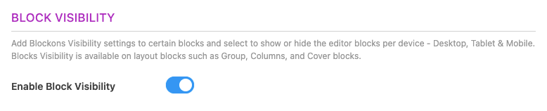
Login to your WordPress Dashboard and navigate to Dashboard -> Settings -> Blockons Settings -> Block Extensions, and scroll down until you find the BLOCK VISIBILITY section and select to Enable Block Visibility.
Once that has been enabled, you will then see some extra settings where you can adjust the breakpoints for the different screen sizes for Tablet and Mobile devices.
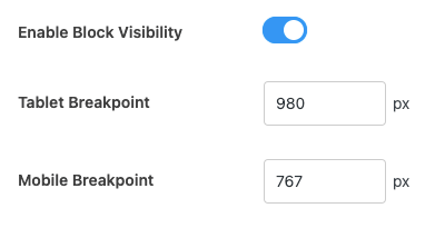
Anything screens larger that the Tablet Breakpoint will be considered the Desktop size.
Take note of the sizes, as you might need to match them across different WordPress plugins that also offer responsive settings and allow you to adjust the screen breakpoint sizes.
Block Visibility settings in the WordPress Editor
Once that is done and you’ve set the sizes you want, then go to the Post or Page where you would like to show or hide certain elements on the page.
Select any of the layout blocks such as Group blocks or Column blocks to be able to adjust the visibility options for those blocks.
Now you will see a new settings panel in the right-hand sidebar called “Block Visibility” and if you open the panel you will be able to select if a block is hidden on Desktop, on Tablet or on Mobile devices.
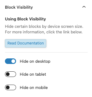
If you want to show or hide certain elements, make sure to wrap them in a group or columns block to be able to add these visibility settings.
These elements will display in the editor as normal if they are showing, and they will have the design shown in this image if they are hidden.
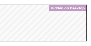
It will display the design above for Desktop, Tablet and Mobile.
Happy hiding!